I always love seeing the progression of websites & tweaks in branding. As a graphic designer, I’ve found that branding your own business is much harder than working for other companies. I’ve come to the conclusion that it’s more of an ever evolving process and that waiting until things are perfect means that you’ll never make progress.
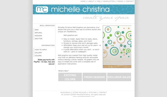
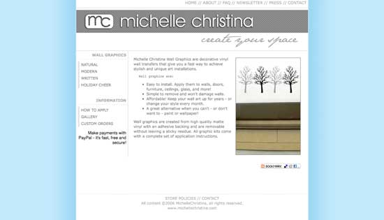
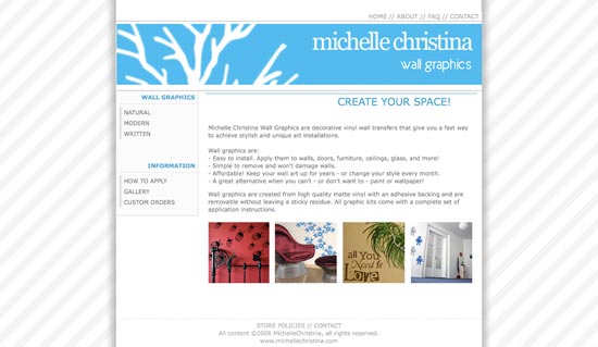
So, a quick look back at the different (and occassionally cringe worthy) forms michellechristina.com has taken on:
2009:
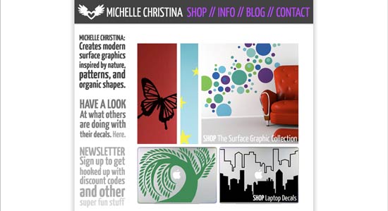
Currently:
This new site is far more minimalist than every other design thus far – this was intentional. I look at tons of artist sites & blogs and think that for showcasing art & photos, the website should really melt into the background instead of distracting with flashy & exciting elements. The focus of this site is also moving from vinyl decals to include more art making. or atleast that’s the plan. :-)


No Comments